As you complete the handout, please don’t just read the commands, please type every single one of them. This is really important: Learning to program is like practicing a conversation in a new language. You will improve gradually, but only if you practice.
If you’re stuck with something, please write down your questions (to share later in class) and try to solve the problem. Please ask your group members for support and, conversely, if another student is stuck, please try to help them out, too. This way, we develop a supportive learning environment that benefits everybody. In addition, get used to the Help pages in RStudio and start finding solutions online (discussion forums, online textbooks, etc.). This is really important, too. You will only really know how to do quantitative research and statistical analyses when you are doing your own research and dealing with your own data. At that point, you need to be sufficiently autonomous to solve problems, otherwise you will end up making very slow progress in your PhD.
Finally, if you do not complete the handout in class, please complete the handout at home. This is important as we will assume that you know the material covered in this handout. And again, the more you practice the better, so completing these handouts at home is important.
References for this handout
Many of the examples and data files from our class come from these excellent textbooks:
Andrews, M. (2021). Doing data science in R. Sage.
Crawley, M. J. (2013). The R book. Wiley.
Fogarty, B. J. (2019). Quantitative social science data with R. Sage.
Winter, B. (2019). Statistics for linguists. An introduction using R. Routledge.
Task 1: Sampling Distributions
The psychologist Geoff Cumming wrote an excellent textbook on The New Statistics (confidence intervals, effect sizes, meta-analyses), in which he advocates a significant reform of the way we use statistics in the social sciences.
The following article summarizes his ideas neatly.
Cumming, G. (2014). The New Statistics: Why and How. Psychological Science, 25(1), 7–29. https://doi.org/10.1177/0956797613504966
The following recordings of one of Cumming’s workshop are also worth watching:
Cumming developed a very helpful software package (ESCI, Exploratory Software for Confidence Intervals) that we will use over the coming weeks to illustrate important ideas in statistics. You can access the software and the companion website here:
Let’s use the Dance tools of the ESCI website to illustrate a few key ideas
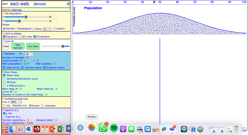
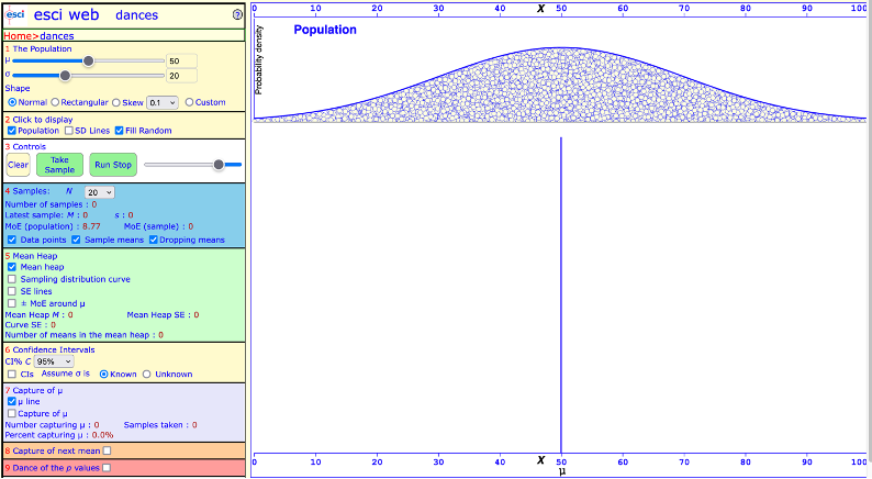
First, go to the website above and click on Dances. Below is a screenshot of the Dances tool.
a screenshot of the ESCI website Dance tool
This tool allows you to draw samples from a population and to manipulate many interesting variables. We can easily visualize the effect of our manipulation.
For this task, we will use the default settings, with the following exception.
In section 5, make sure that Mean heap and Sampling distribution curve are turned on (clicked).
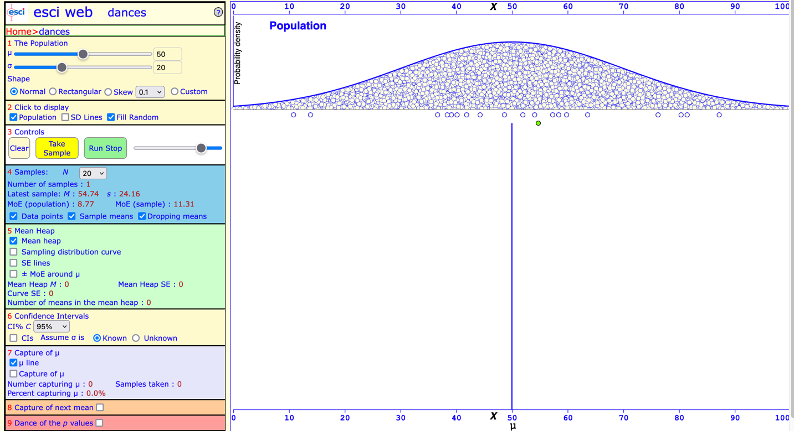
Now go to section 2 and press Take sample. This will draw one sample (n = 20, see section 4 to confirm) from our population distribution (\(\mu\)= 50, \(\sigma\) = 20). Your screen will look similar to this (though not identical, as we are drawing randomly).
a screenshot of the ESCI website Dance tool
The empty bubbles underneath the population distribution are individual observations. There should be 20 as we chose sample size n = 20 (see section 4). The green bubble represents the mean of this particular sample (M = 54.74, SD = 24.16, see section 4 last sample).
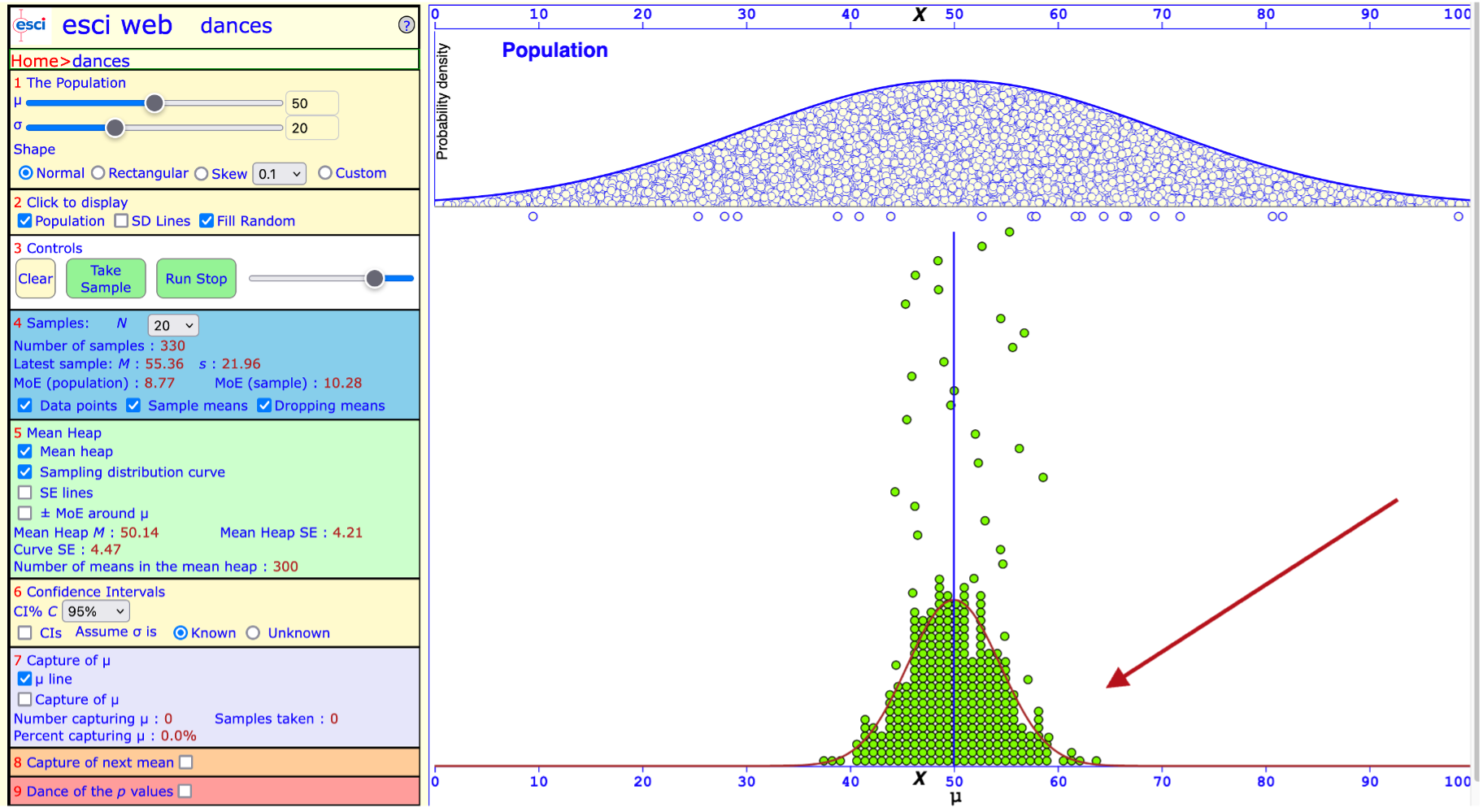
Let’s now draw another random 200 samples from the same distribution. This is like doing 200 experiments in sequence, each with the same number of observations (n = 20), but each time with different ones.
You can press Take sample in section 3 another 200 times. Or you can click Run stop until the the number of samples in section 3 is close to 200. The slider to the right of Run stop allows you to control the speed at which samples are drawn.
Your screen should look roughly like this now. The emerging distribution at the bottom is your sampling distribution.
a screenshot of the ESCI website Dance tool
Task 2: Playing around with the normal distribution
The following task is adapted from Winter (2019). The purpose is to familiarize you with the normal distribution.
To complete this section, we first need to load the tidyverse package.
First, we use a random number generation function called runif() to create a set of 50 uniformly distributed numbers. The name stands for “random uniform”, so this specific random number generator will generate datasets with normally distributed data.
This command creates a variable x and assigns 50 random uniformly distributed numbers.
x <-runif(50)
You can now look at the numbers in variable x. Remember that my random numbers will look different to yours.
By default, the runif() function will generate random values between 0 and 1. We can override the default setting by adding the min and max arguments. The following command will generate uniformly distributed random numbers between 2 and 6.
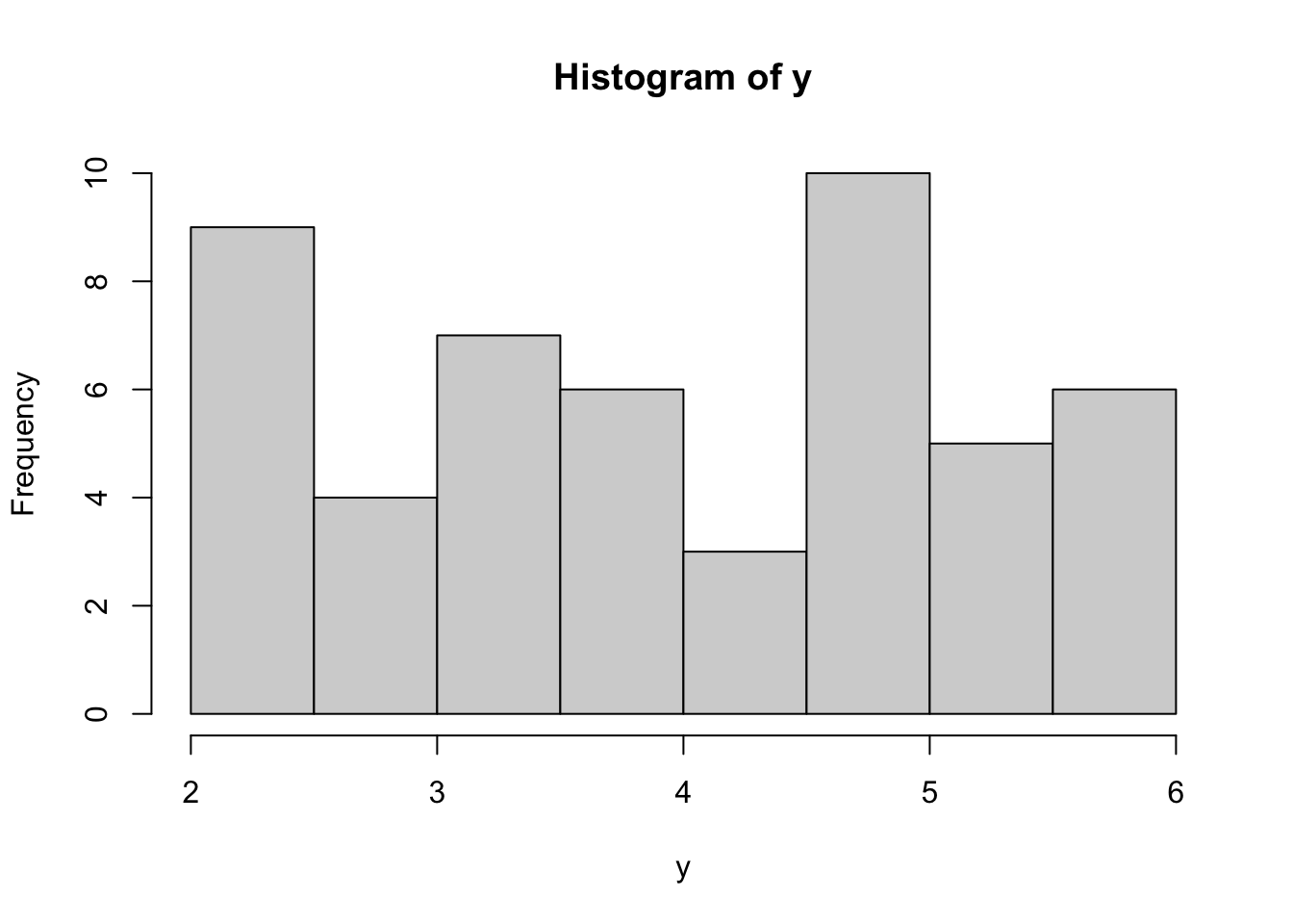
It’s good to visualize the data. The following histogram does the trick. Remember that my plot will look different from yours as the dataset is randomly generated for each of us.
hist(y)
Note that the histogram doesn’t necessarily look like a normal distribution, despite the fact that the data are drawn from a normally-distributed population. (The mean of the above data is 3.9654885, right in the middle, as you would expect from a normal distribution.)
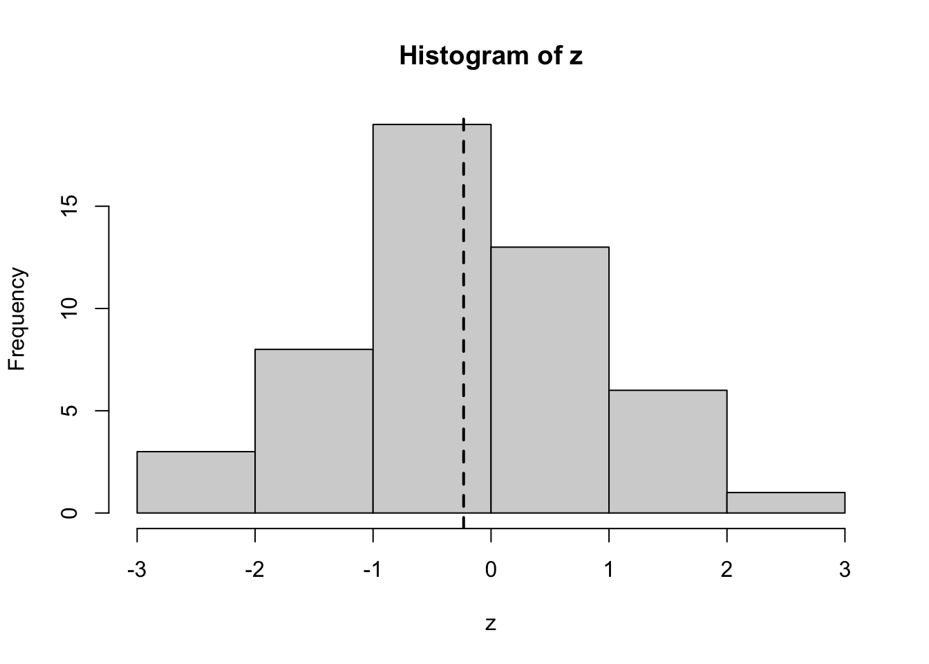
The following command assigns 50 random numbers from a normal distribution, produces a histogram and adds a dashed line (lty = 2) with width 2 (lwd = 2) to indicate the mean.
z <-rnorm(50)hist(z)abline(v =mean(z), lty =2, lwd =2)
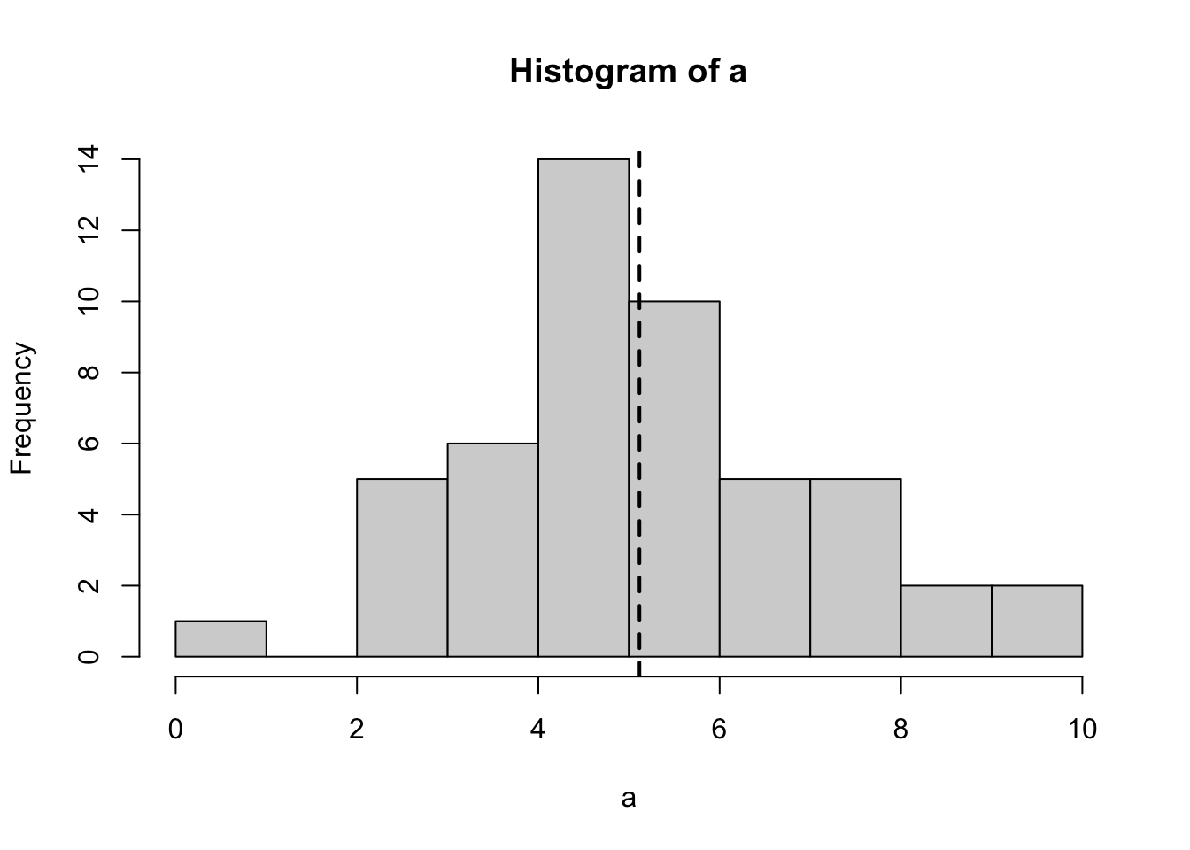
We can also create random data with specific means and standard deviations. All we need to do is add the arguments mean and sd to the rnorm() function.
a <-rnorm(50, mean =5, sd =2)
We can verify if the mean and standard deviation are really what we specified.
For example, the following command creates a histogram with the dashed line representing the mean. This shows that the mean of the data set is really 5, as specified in the argument mean above.
hist(a)abline(v =mean(a), lty =2, lwd =2)
And we can also verify the means and standard deviation by typing the following commands. (My actual values will be different from yours, but for all of us the rounded mean should be 5 and the standard deviation 2.
#|eval: truemean(a)
[1] 5.115569
sd(a)
[1] 1.938374
The quantile() function allows us to compute percentiles. If we just run the quantile() function on our data set a without supplying additional arguments, the output will show the minimum (0th percentile) and maximum (100th percentile) as well as the first quantile (Q1, 25% percentile), the second quantile (Q2, 50% percentile, which is the median), and the third quantile (Q3, 75% percentile).
Let’s use the quantile() function to check the 68-95-99.7 rule.
First, we check the values that span the 68% interval. The interval corresponds to the 16th and 84th percentiles.
quantile(a, 0.16)
     16%
3.419582
quantile(a, 0.84)
     84%
7.275486
If the 68% rule works, the resulting numbers should be close to the interval by M – SD and M + SD. We can confirm this by writing the following commands. And yes, it looks like the numbers are fairly close to the 16th and 84th percentile.
mean(a) -sd(a)
[1] 3.177195
mean(a) +sd(a)
[1] 7.053943
We now do the same for the 95% interval, which corresponds to the interval between the 2.5th percentile and the 97.5th percentile.
quantile(a, 0.025)
    2.5%
2.108596
quantile(a, 0.975)
   97.5%
9.006971
The 2.5th and 97.5th percentile should correspond roughly to +/- 2 SD around the mean.
mean(a) -2*sd(a)
[1] 1.238821
mean(a) +2*sd(a)
[1] 8.992317
As you can see when you compare the two previous calculations, the 95% rule is a little off. This is because we are dealing with a small data set (n = 50).
Last but not least. Let’s develop a better intuition for how normally-distributed data might look like. As you play around with the following commands, observe how they affect the distribution.
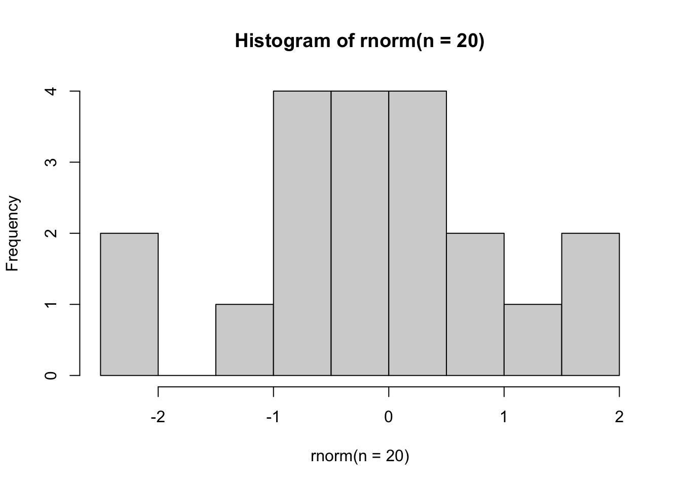
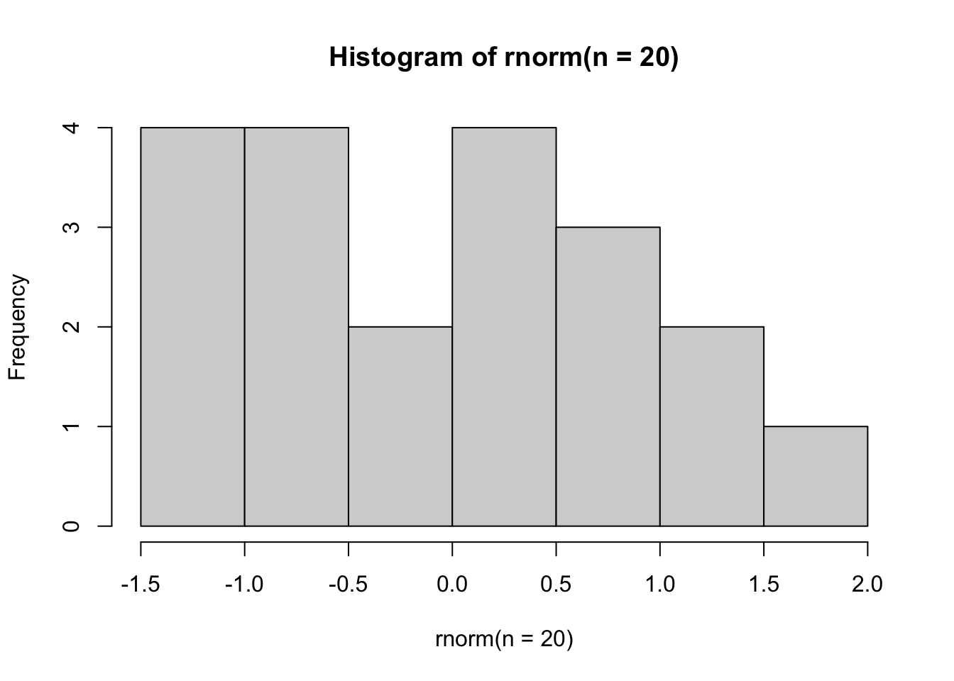
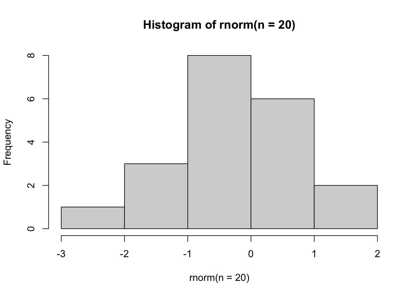
First, let’s run the following five commands. Each draws random data from a normal distribution, and each time, we have 20 observations. Observe and compare the shapes of the five histograms. What do you notice?
hist(rnorm(n =20)) # Observe the shape of the histogram
hist(rnorm(n =20)) # Observe the shape of the histogram
hist(rnorm(n =20)) # Observe the shape of the histogram
hist(rnorm(n =20)) # Observe the shape of the histogram
hist(rnorm(n =20)) # Observe the shape of the histogram
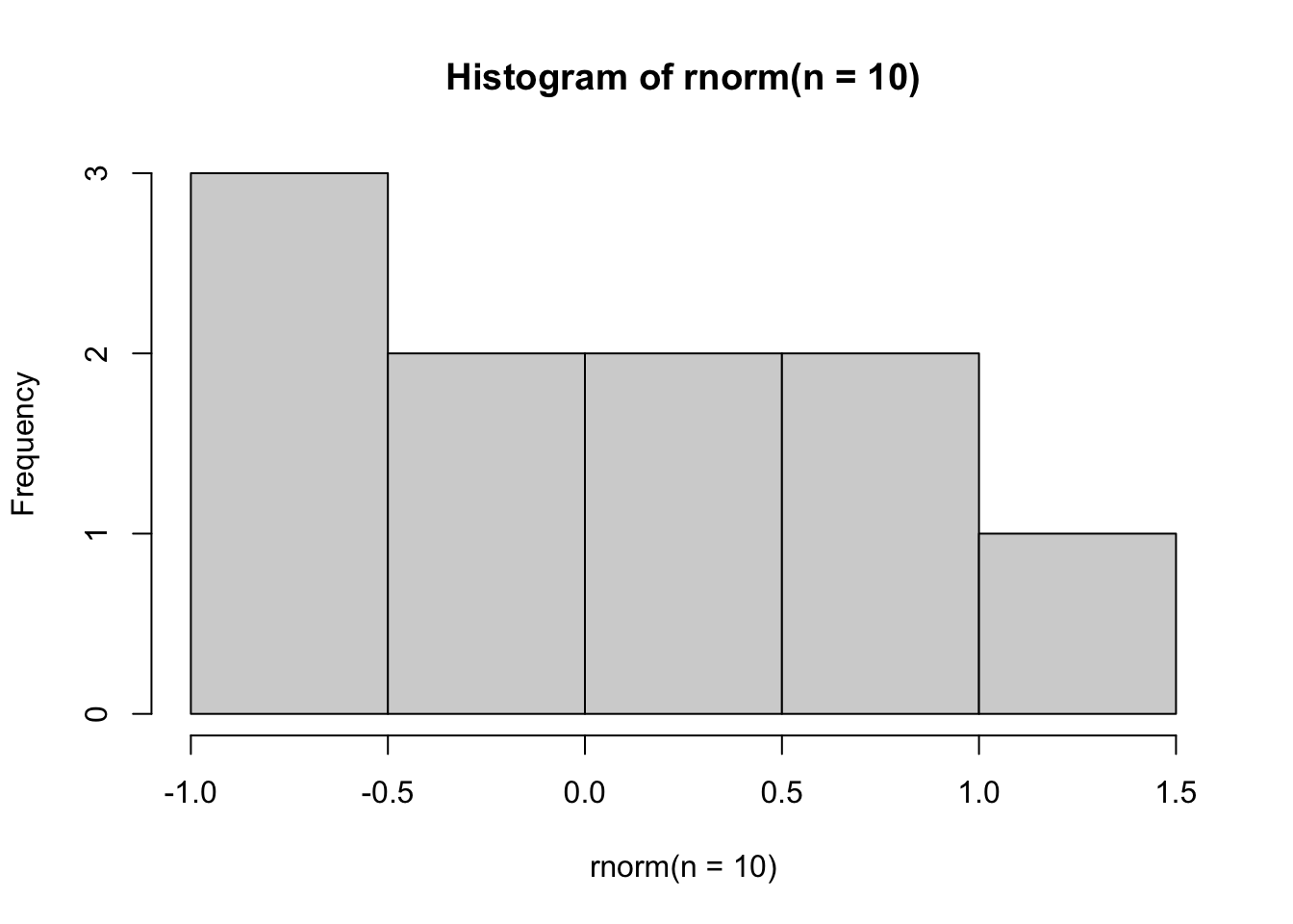
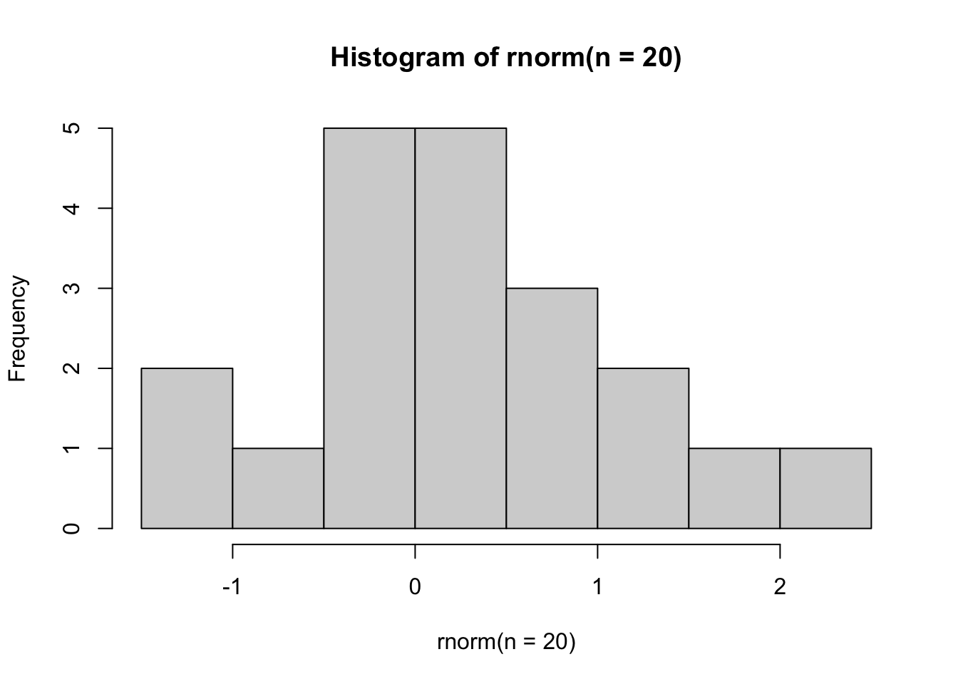
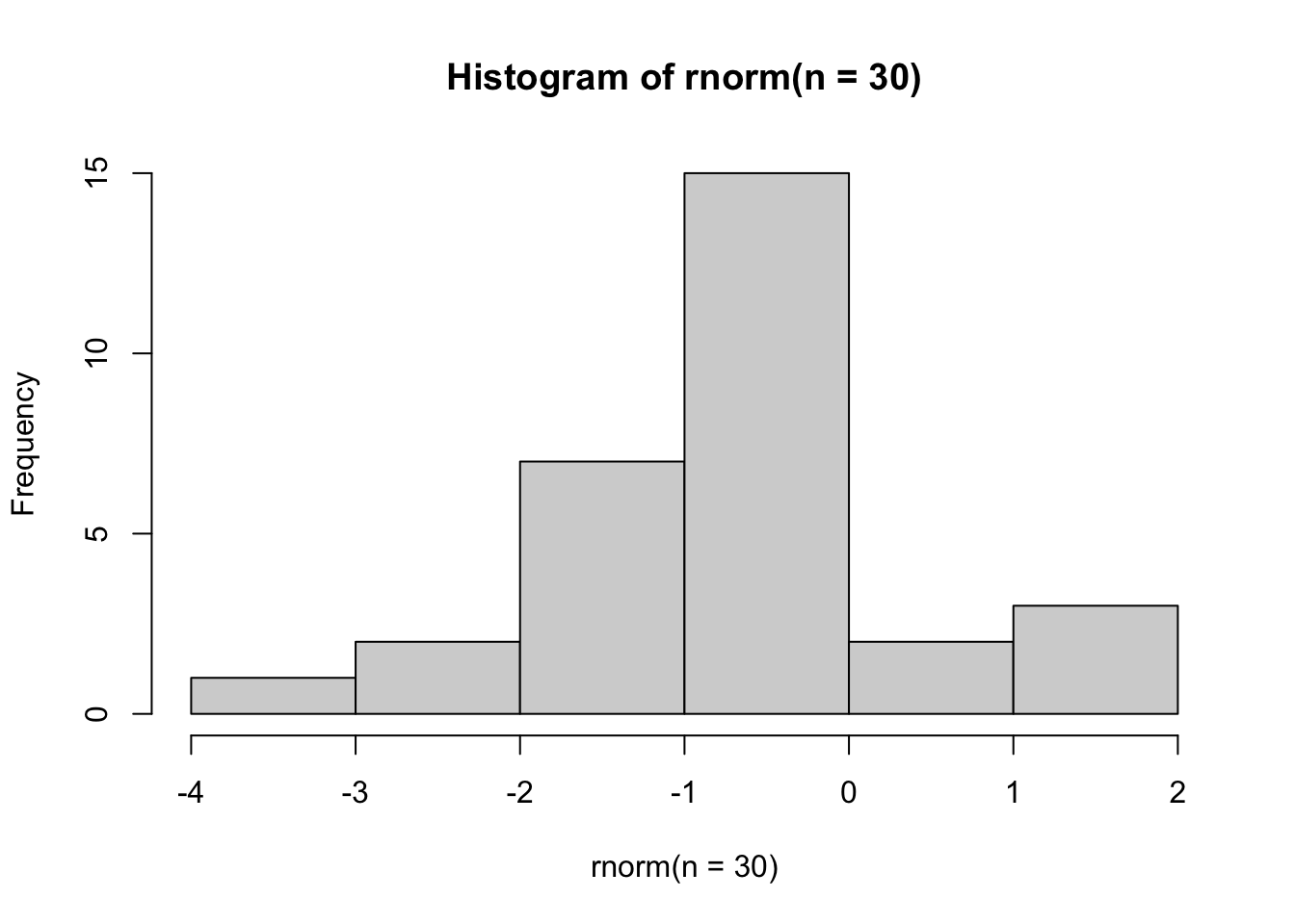
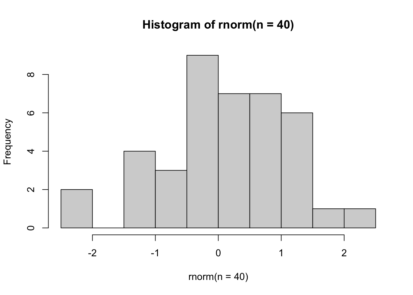
You might have noticed that often the distribution might not look normal at all, despite the fact that an underlying normal distribution was used to generate the data.
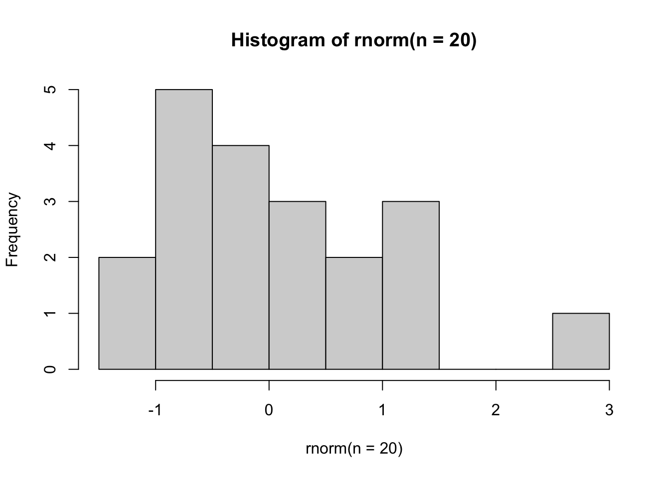
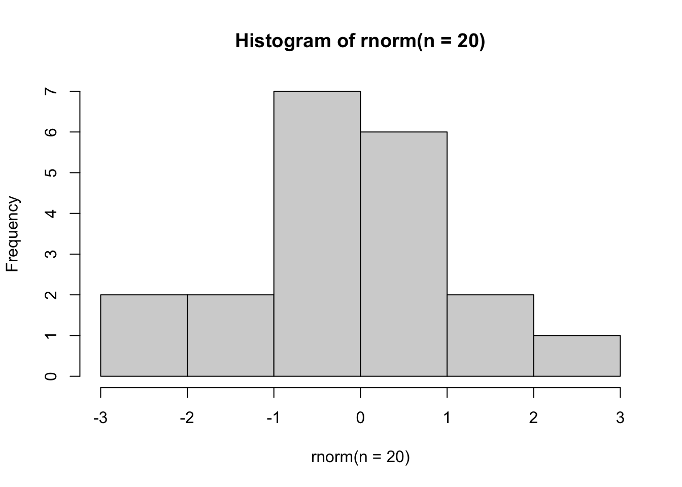
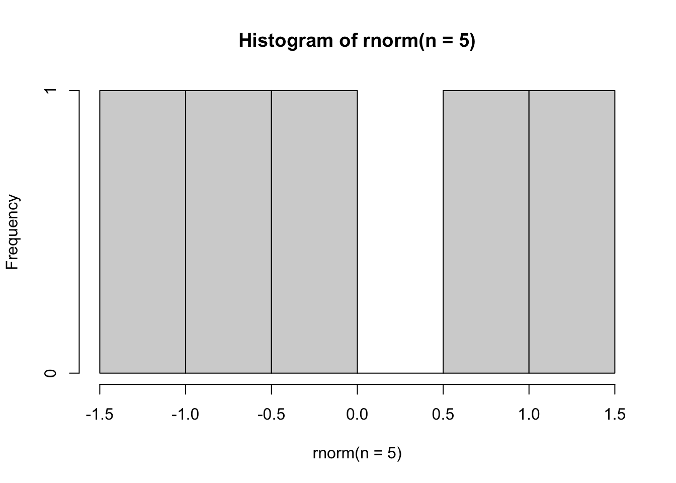
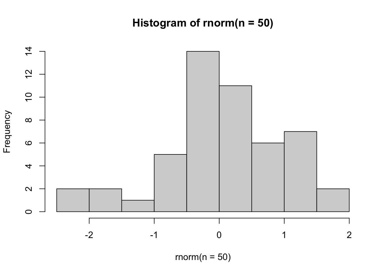
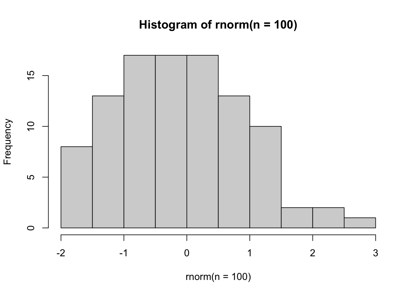
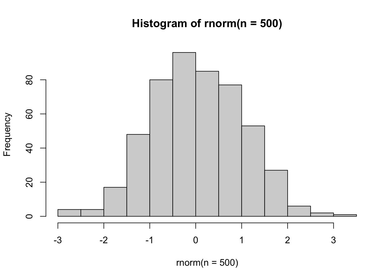
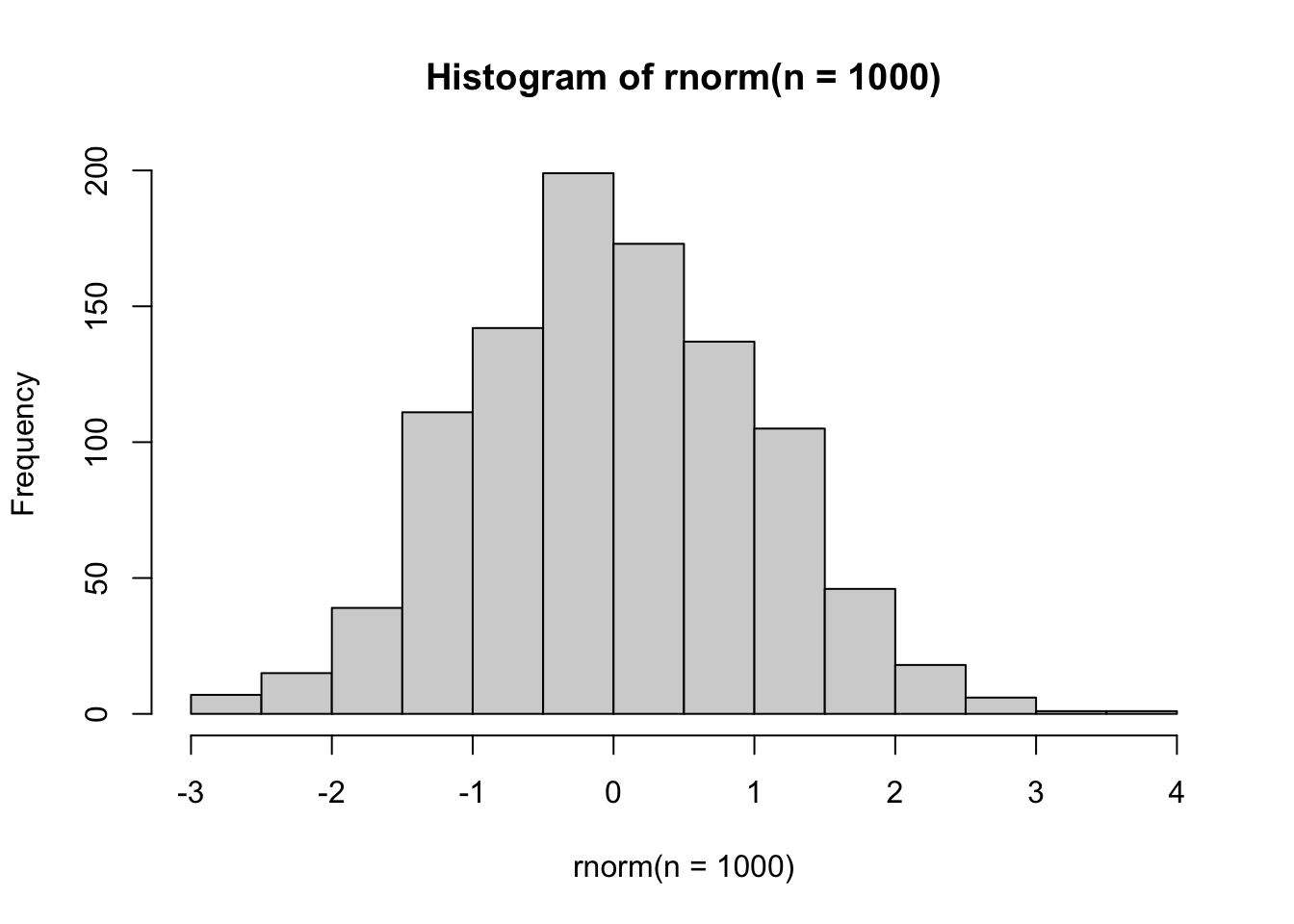
Let’s now observe the effect of changing the sample size n. Run each of the following commands and observe the shape of the distribution. Remember: They are all drawn from the normal distribution. What do you notice?
hist(rnorm(n =5))
hist(rnorm(n =10))
hist(rnorm(n =20))
hist(rnorm(n =30))
hist(rnorm(n =40))
hist(rnorm(n =50))
hist(rnorm(n =100))
hist(rnorm(n =500))
hist(rnorm(n =1000))
Task 3: The Law of Large Numbers in Action
The following task is adapted from Brown (2021). It’s a nice way to visualize the Law of Large Numbers in action. (Some chunks of code are a bit more advanced, don’t worry if you don’t understand all of it yet. Most of the code should be clear.)
First, we need to install the reshape package. (We already installed tidyverse above.)
#|eval: false#install.packages('reshape')
library(reshape)
Attaching package: 'reshape'
The following object is masked from 'package:dplyr':

    rename
The following objects are masked from 'package:tidyr':

    expand, smiths
We use the set.seed() function to create “reproducible randomness”. Without getting into the technicality of random numbers in R, the short of it is: randomness is fake but is sufficient for what we want it to do in almost every situation. It approximates randomness, but true randomness is not easily computed. Interestingly, to avoid this issue of computer-generated randomness, one UK cybersecurity company uses lava lamps to generate true randomness…
If we run the following command, and then do not deviate in the following steps, we will all end up with the same “random” output.
set.seed(3376)
We can check this by running this command below. Your numbers should be the same as mine. Confidently, I reckon you will get 99, 74, and 19. If not, set the seed above again, and then the code below.
sample(100, 3)
[1] 99 74 19
Just out of interest, the chances of you getting the same numbers as me completely randomly (if we didn’t set the seed) would be 1/100 * 1/99 * 1/98 or 0.000001%.
The following line of code creates three numbers in our environment with a population mean \(\mu\) = 100 and population standard deviation \(\sigma\) = 10. We will use these numbers to draw random samples next
mu=100; sigma=10; n=10
Now we tell R that we want to create a variable where we can put the mean from each sample we draw. Each variable (xbar1, xbar2, xbar3) will hold five observations.
We use rep() function to do create placeholders. The rep() function simply replicates the values in the first argument position. In the three examples below, the digit is 0. So, writing xbar1 = rep(0,5) means the variable xbar1 should consist of five 0 0 0 0 0, xbar2 should contain 10 zeros, and xbar 3 should contain 100.
For each variable (xbar1, xbar2, xbar 3), we then ask R to conduct an operation five times by means of the for() function. This is a loop that says: For each element in xbar 1, xbar2, and xbar3, replace it with something else. And the something else if specified in braces {}, namely the means of, respectively, 5, 10 and 100 randomly drawn samples from our population.
xbar1=rep(0,5)for (i in1:5) {xbar1[i]=mean(rnorm(n, mean=mu, sd=sigma))}xbar2=rep(0,10)for (i in1:10) {xbar2[i]=mean(rnorm(n, mean=mu, sd=sigma))}xbar3=rep(0,100)for (i in1:100) {xbar3[i]=mean(rnorm(n, mean=mu, sd=sigma))}
The above commands have calculated the means for 5, 10, 100 samples and placed the results in three variables xbar1, xbar2, xbar 3.
The following commands reorder the structure of the data so that we can place density plots over each. This is done by means of the list() and melt() functions.
x <-list(v1=xbar1, v2=xbar2, v3=xbar3)data <-melt(x)
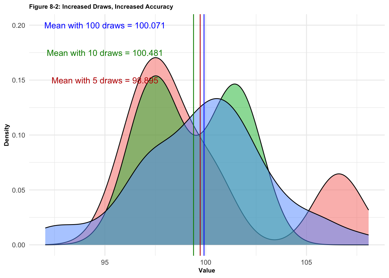
We are now ready to produce a density plot with three sampling distributions. One representing the mean with 5 random samples from the population, one with 10 draws, and one with 50 draws. If we were using the ESCI Dances tools, this would correspond to pressing the Take sample button 5, 10 and 50 times, respectively.
If you run the following commands, you will get the density plot at the bottom (Figure 8-2 from Brown, 2021).
ggplot(data, aes(x = value, fill = L1)) +geom_density(alpha = .50) +ggtitle("Figure 8-2: Increased Draws, Increased Accuracy") +xlab("Value") +ylab("Density") +theme_minimal() +theme(plot.title =element_text(size =8, face ="bold")) +theme(axis.title =element_text(size =8, face ="bold")) +geom_vline(xintercept = xb1, col ="#bf0000") +geom_vline(xintercept = xb2, col ="#008b00") +geom_vline(xintercept = xb3, col ="#0000ff") +annotate("text",x =95,y = .15,label ="Mean with 5 draws = 98.895",col ="#bf0000" ) +annotate("text",x =95,y = .175,label ="Mean with 10 draws = 100.481",col ="#008b00" ) +annotate("text",x =95,y = .20,label ="Mean with 100 draws = 100.071",col ="#0000ff" ) +theme(legend.position ="none")
Inspect the density plots. Remember the true population mean is = 100. How does the number of randomly-drawn samples (5, 10, 100 samples drawn from the population) affect the three sampling distributions and the mean of each?
Task 4: Population distributions and sampling distributions
Let’s return to Cumming’s ESCI website. In this task, we want to explore what happens when we change the distribution of the population from which draw samples.
In section 1, you can change the shape of the distribution: normal, rectangular, skew.
### Sampling distribution of a normally-distributed population
First, let’s use the normal distribution (the default).
Remember to select Mean heap and Sampling distribution curve in section 5. This will be important so that we can visualize the shape of the sampling distribution.
Then, go to section 2 and click Run stop until you have drawn 200 samples from the normal population distribution. Again, you can accelerate by using the slider.
Note down what shape the sampling distribution has.
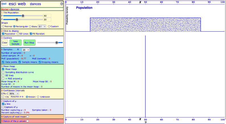
Sampling distribution of a uniformly-distributed population
Let’s now see what happens if we change the population distribution from normal to rectangular. Now, the population distribution has a rectangular distribution.
a screenshot of the ESCI website Dance tool
Again, check that Mean heap and Sampling distribution curve are selected.
Then, go to section 2 and click Run stop until you have drawn 200 samples from the rectangular population distribution.
Note down the shape of the new sampling distribution.
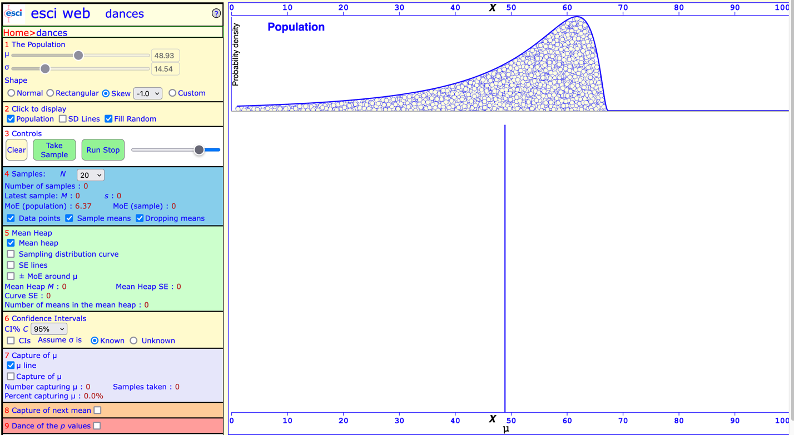
Sampling distribution of populations with skewed distributions
This time, go to section 1 and select skew, value –1. This produces a negatively-skewed population distribution.
a screenshot of the ESCI website Dance tool
Again, draw 200 samples. What does the sampling distribution look like when you draw samples from the a negatively-skewed population distribution?
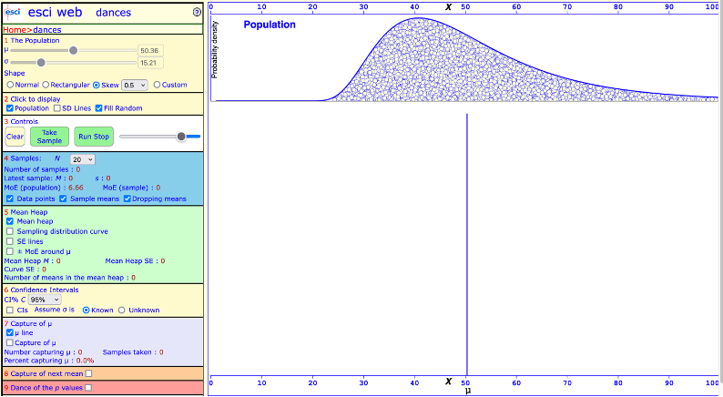
Finally, go to section 1 and select skew, value +0.5. This produces a positively-skewed population distribution.
a screenshot of the ESCI website Dance tool
Draw 200 samples. What does the sampling distribution look like when you draw samples from the a positively-skewed population distribution?
Task 5: The Central Limit Theorem in Action
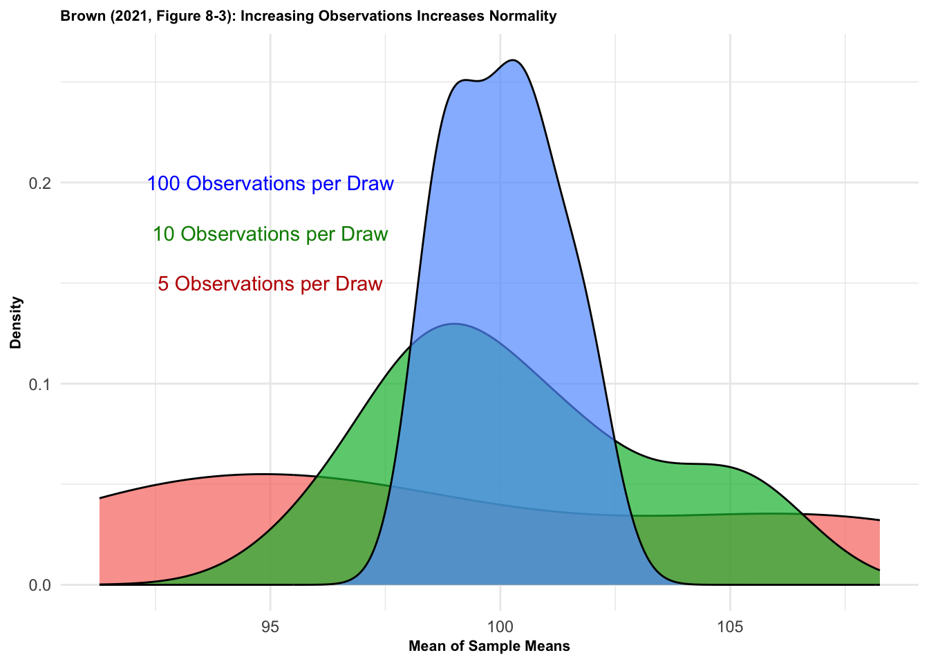
Finally, let’s see the Central Limit Theorem in action. The code and figure are adapted from Brown (2021).
Set the seed to 3376 as we did last time so that we all get the same answers.
Need a reminder?
set.seed(3376)
The population mean \(\mu\) (mu) is set to 100, the population standard deviation is \(\sigma\) (sigma) = 10. What changes is the number of observations in each sample. The variables xbar1, xbar2, and xbar3 will have n = 5, n = 10, and n = 100, respectively. We ran this code above already, but we do it again to ensure everything is consistent.
mu=100; sigma=10; n=5xbar1=rep(0,10)for (i in1:10) {xbar1[i]=mean(rnorm(n, mean=mu, sd=sigma))}mu=100; sigma=10; n=10xbar2=rep(0,10)for (i in1:10) {xbar2[i]=mean(rnorm(n, mean=mu, sd=sigma))}mu=100; sigma=10; n=100xbar3=rep(0,10)for (i in1:10) {xbar3[i]=mean(rnorm(n, mean=mu, sd=sigma))}
We are now ready to reorder the data to produce the density plot.
x <-list(v1=xbar1,v2=xbar2,v3=xbar3)data <-melt(x)ggplot(data, aes(x = value, fill = L1)) +geom_density(alpha = .70) +theme_minimal() +theme(plot.title =element_text(size =8, face ="bold")) +theme(axis.title =element_text(size =8, face ="bold")) +ggtitle("Brown (2021, Figure 8-3): Increasing Observations Increases Normality") +annotate("text",x =95,y = .15,label ="5 Observations per Draw",col ="#bf0000" ) +annotate("text",x =95,y = .175,label ="10 Observations per Draw",col ="#008b00" ) +annotate("text",x =95,y = .20,label ="100 Observations per Draw",col ="#0000ff" ) +theme(legend.position ="none") +xlab("Mean of Sample Means") +ylab("Density")
Inspect the density plots with the three sampling distributions. Remember that the population mean and standard deviation is the same for each sampling distribution. What changes is the number of observations in each sample, n = 5, n = 10, and n = 100, respectively.
How does changing the number of observations affect the three sampling distributions? Observe, for example, the means (you calculated them) and the shapes of the sampling distributions?
 ### Sampling distribution of a normally-distributed population