Set up environment
── Attaching packages ─────────────────────────────────────── tidyverse 1.3.2 ──
✔ ggplot2 3.4.4     ✔ purrr   1.0.2
✔ tibble  3.2.1     ✔ dplyr   1.1.2
✔ tidyr   1.3.0     ✔ stringr 1.5.0
✔ readr   2.1.3     ✔ forcats 0.5.2
── Conflicts ────────────────────────────────────────── tidyverse_conflicts() ──
✖ dplyr::filter() masks stats::filter()
✖ dplyr::lag()    masks stats::lag()
# anything else goes here
Import Data
Read in key datafiles
<- read_csv ("swiss_crime_2022.csv" )
Rows: 19 Columns: 19
── Column specification ────────────────────────────────────────────────────────
Delimiter: ","
chr  (2): crime, crime_type
dbl (17): male, female, age18_19, age20_24, age25_29, age30_34, age35_39, ag...

ℹ Use `spec()` to retrieve the full column specification for this data.
ℹ Specify the column types or set `show_col_types = FALSE` to quiet this message.
Check out the data
# A tibble: 6 × 19
  crime     crime_type  male female age18_19 age20_24 age25_29 age30_34 age35_39
  <chr>     <chr>      <dbl>  <dbl>    <dbl>    <dbl>    <dbl>    <dbl>    <dbl>
1 Intentio… Severe vi…    82     20        0       16       17       15       13
2 Grievous… Severe vi…   204      6        9       53       42       32       28
3 Female g… Severe vi…     0      0        0        0        0        0        0
4 Hostage … Severe vi…     0      0        0        0        0        0        0
5 Rape      Severe vi…    71      0        0        7       13       11       12
6 Violent … Severe vi…     6      0        0        3        1        0        1
# ℹ 10 more variables: age40_44 <dbl>, age45_49 <dbl>, age50_59 <dbl>,
#   age60_69 <dbl>, age70plus <dbl>, nat_swiss <dbl>, nat_foreign <dbl>,
#   foreign_permit <dbl>, foreign_other <dbl>, foreign_unknown <dbl>
 [1] "crime"           "crime_type"      "male"            "female"
 [5] "age18_19"        "age20_24"        "age25_29"        "age30_34"
 [9] "age35_39"        "age40_44"        "age45_49"        "age50_59"
[13] "age60_69"        "age70plus"       "nat_swiss"       "nat_foreign"
[17] "foreign_permit"  "foreign_other"   "foreign_unknown"
Tidying data to minimum required
What do we need to keep if we are wanting to visualise the differences in type of crime convicted in the Swiss Adult population according to age?
<- data_raw |> select (crime, crime_type, contains ("age" ))
How do I condense down all the specific crimes into one value?
<- data |> group_by (crime_type) |> mutate (age18_19 = sum (age18_19),age20_24 = sum (age20_24),age25_29 = sum (age25_29),age30_34 = sum (age30_34),age35_39 = sum (age35_39),age40_44 = sum (age40_44),age45_49 = sum (age45_49),age50_59 = sum (age50_59),age60_69 = sum (age60_69),age70plus = sum (age70plus)|> select (- crime) |> distinct ()# factor the group data <- data_tidy |> mutate (crime_type = factor (crime_type, levels = c ("Moderate violence (threat of violence)" , "Moderate violence (exercise of violence evt. threat of violence)" ,"Severe violence (exercise of violence)" )))
pivot so it’s ready for plotting
<- data_tidy |> pivot_longer (cols = age18_19: age70plus, names_to = "age_group" , values_to = "convictions" )
Plotting
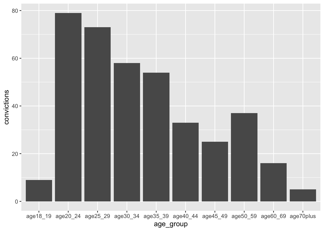
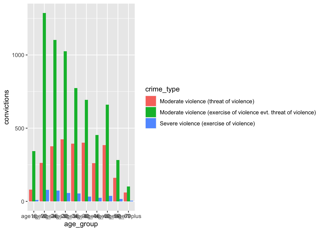
|> filter (crime_type == "Severe violence (exercise of violence)" ) |> ggplot (aes (age_group, convictions)) + geom_col ()#try colour first, and then go to fill |> ggplot (aes (age_group, convictions, fill = crime_type)) + geom_col (position = "dodge" )
What can we see in the dataset (as well as the x-axis) that indicates this is a misleadingly organised dataset?
The age ranges are not consistent - so the above plot is misleading, just like the examples in week 4.
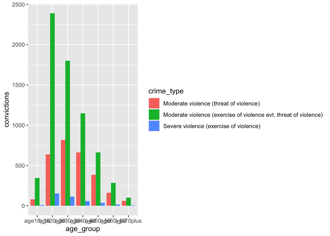
<- data_tidy |> mutate (age20_29 = sum (age20_24, age25_29),age30_39 = sum (age30_34, age35_39),age40_49 = sum (age40_44, age45_49),.before = age50_59|> select (- c (age20_24, age25_29, age30_34, age35_39, age40_44, age45_49))<- data_tidy_ages |> pivot_longer (cols = age18_19: age70plus, names_to = "age_group" , values_to = "convictions" ) |> ggplot (aes (age_group, convictions, fill = crime_type)) + geom_col (position = "dodge" )
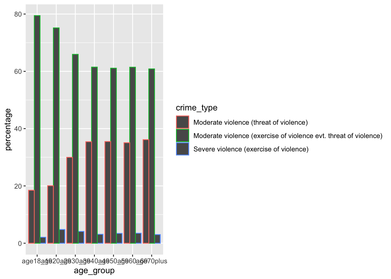
<- data_tidy_ages_long |> group_by (age_group) |> summarise (total = sum (convictions))<- data_tidy_ages_long |> left_join (data_tidy_ages_long_sum, by = join_by (age_group)) |> mutate (percentage = convictions/ total* 100 )##sanity check #data_tidy_ages_long_percent |> # filter(age_group == "age18_19") |> # pull(percentage) |> sum()
|> ggplot (aes (age_group, percentage, colour = crime_type)) + geom_col (position = "dodge" )
What inferences can we draw from this? What else could we explore?